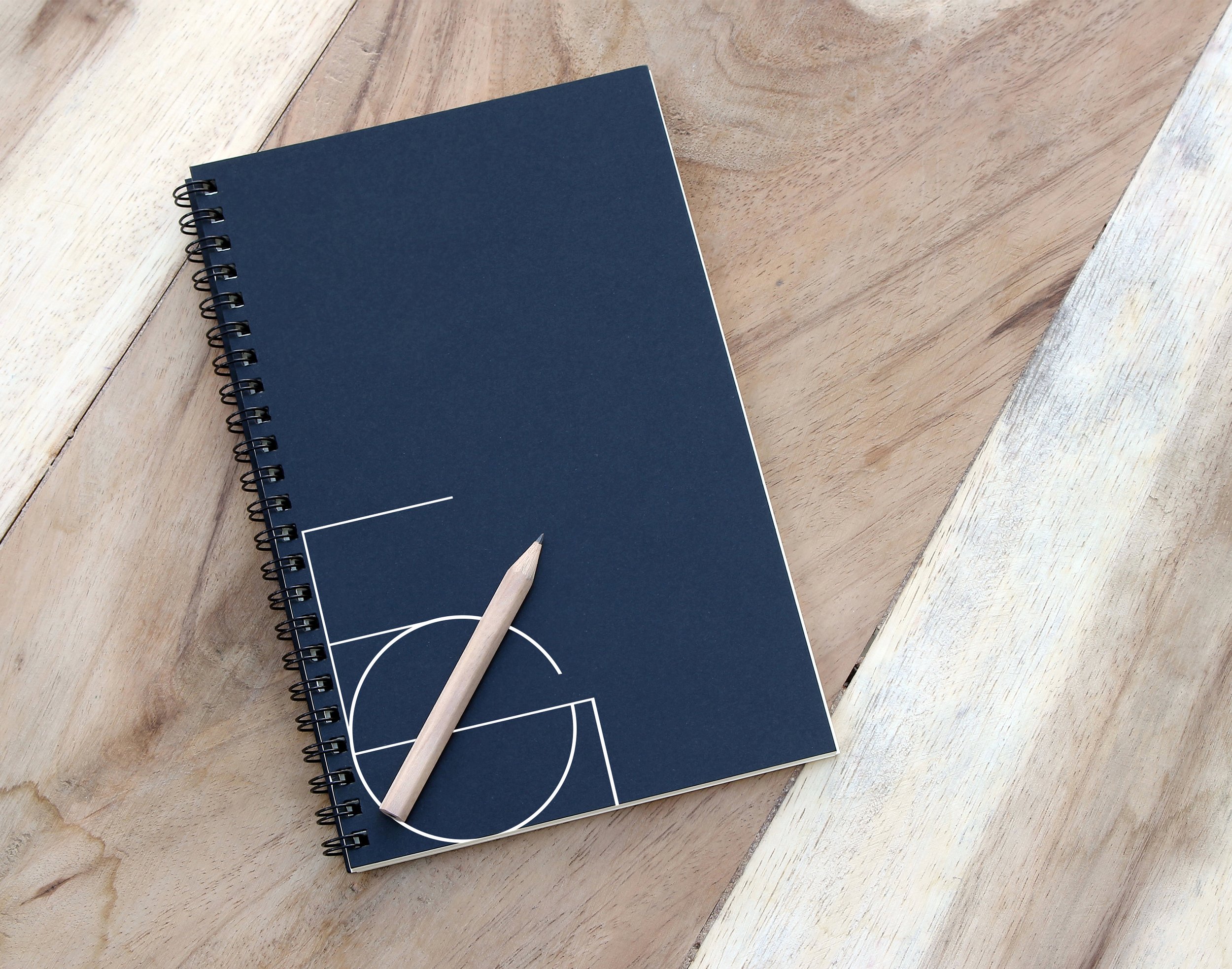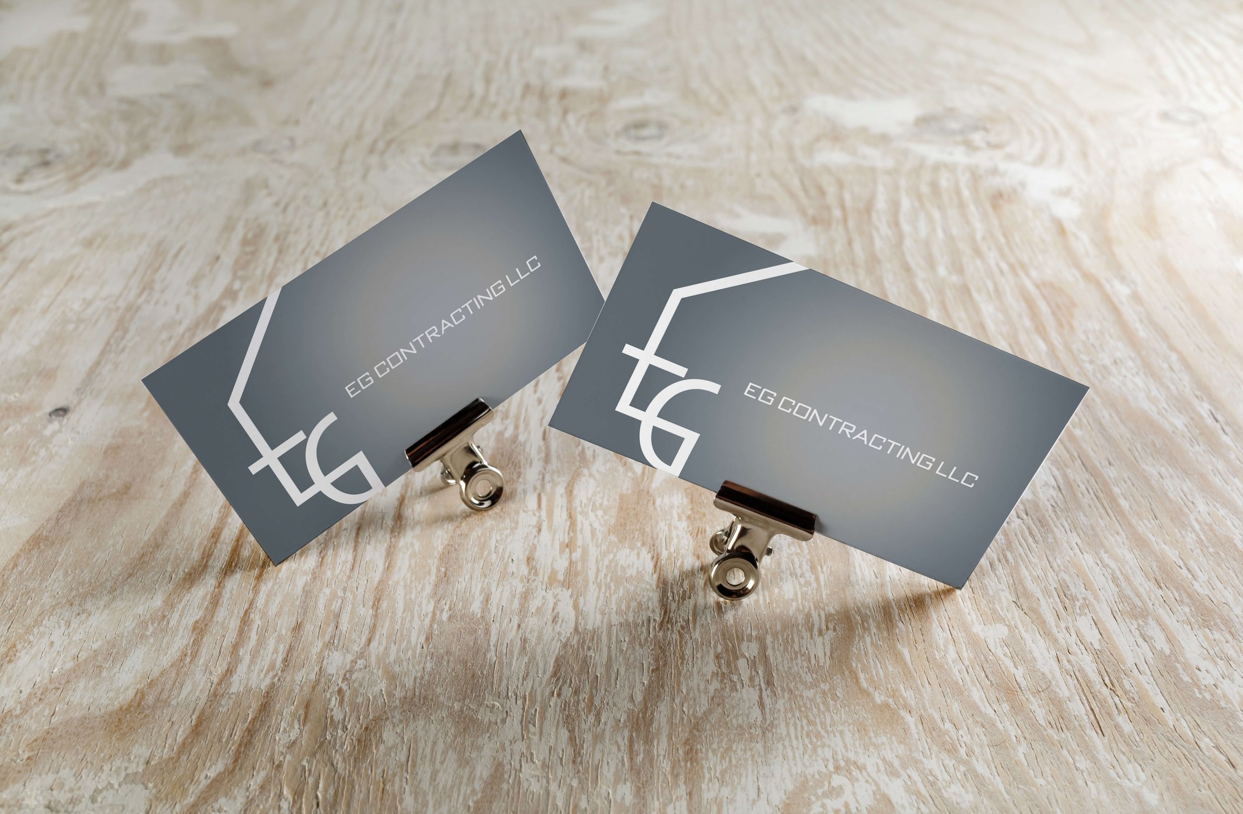
a logo for a contracting business.
logo III
EG Contracting LLC was looking for a logo design that would speak to the nature of their business. They were especially hoping to use it on business cards letterheads. I showed the client three options and in-situ mock-ups.
Graphic Designer
Karina Cruz
Client
EG Contracting LLC
Date
December 2021
Option 1
This logo plays with the lines and mathematical precision that goes into contracting work. The E and G are drawn using a perfect circle and straight lines.
This is a modern, sleek, and clean design.
Option 2
This logo is the most basic of the three options. The font explores a more rugged and less modern vibe. What really makes this logo stand out is the way the G expands to create the silhouette of a screw.
Options 3a & 3b
This logo uses the initials of the company to form the figure of a house. Like Option 1, it plays around with the precision needed in this line of work, but uses the initials to create an image.
Option 3a is more focused on the initials and 3b is more focused on the image of the house.
The client selected 3a.


